Before the Feed: How the Small Magazine Made Room for a Point of View
Small magazine publishing turns limited space into a clear editorial voice, helping each image, essay and omission feel like a deliberate choice.
Small magazine publishing starts with a familiar pressure: there is room for one more piece, but not for everything you like. That constraint is not just a matter of page count. It can make an editor’s choices visible, giving a publication a point of view before a reader has reached the last page.
Space makes selection part of the voice
A small magazine cannot include every promising pitch, photograph or note from the margins. Its identity emerges in the things it puts beside one another, and in what it leaves out. A reader may not agree with every choice, but can sense that someone has made them.
Think of the issue as a small table: each object takes up room and changes how its neighbours look. A short essay on repairing clothes might sit beside portraits of worn fabric and a review of a local mending shop. Those pieces do not need to make the same argument; their proximity can create one.
For an editor, this means selecting for relationship as well as individual quality. Ask what a piece adds to the issue’s conversation, what it changes about the piece beside it, and whether that connection is legible without a long explanation.
A recurring interest is stronger than a rigid subject
A recognisable magazine need not cover only one topic. Its continuity may come from a recurring curiosity: how people maintain things, how neighbourhoods change, or what gets overlooked in everyday work. That thread gives varied contributions a reason to share a cover.
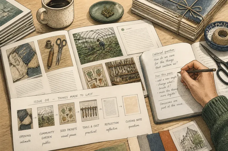
For instance, an issue about “things made to last” could include a profile of a cobbler, an illustrated guide to mending a chair seat and a short reflection on family recipes. The link is not a narrow subject label but an editorial question about care, skill and time.
Write that question in plain language before commissioning. Then use it as a filter, not a cage: a strong contribution can complicate the question or take it somewhere unexpected. If every piece merely confirms the same answer, the issue may feel like a pamphlet for a conclusion already reached.
Sequence turns separate contributions into an argument
Page order is editorial work, not a final bit of housekeeping. A sharp opening can establish the issue’s texture; a quieter piece after it can alter the pace. A visual pause can give a dense essay room to settle, while a closing note can leave a useful question in the reader’s mind.
Make a rough contents list with each contribution’s subject, tone and length. Move the entries around and read the sequence aloud as a series of shifts: intimate to public, practical to reflective, image-led to text-heavy. The aim is not a perfect rhythm but a route that feels chosen rather than accidental.
Say you have commissioned a long account of a community garden, a set of close-up photographs of seed packets and a brief piece about the cost of shared tools. If the cost piece opens, it may frame the garden as a practical resource; placed after the photographs, it may raise questions about what gets preserved and who can afford to take part. The material stays the same, but the issue’s emphasis changes.
What should a small magazine leave out?
How do you choose between two strong pieces?
Compare their roles in the issue, not only their polish. If both make the same point in a similar tone, keep the one that brings a sharper detail or a more surprising perspective.
Does every contribution need to match the theme?
No, but a reader should be able to feel why it belongs. A deliberate contrast can widen the theme; an unrelated piece may simply consume space that could have strengthened the issue’s line of thought.
How can a visual piece contribute to the editorial voice?
Consider its subject, framing, colour and placement alongside the writing. A photograph of a workbench, for example, may make an essay about craftsmanship feel intimate, while a broad street scene can shift attention towards shared spaces.
What if the issue feels too narrow?
Look for a missing perspective or a useful complication, rather than adding material for variety alone. A piece that questions the issue’s assumptions can open it up without dissolving its focus.
Production limits can clarify the form
Small-scale publishing involves practical choices: paper stock, page dimensions, colour printing, binding and the number of pages a team can edit and assemble. These are not neutral details. A compact format may suit brief texts and close images; a larger sheet may give diagrams or photographs more breathing room.
Choose a format that supports the material and the people making it. A simple folded sheet can carry a short sequence of text and images, while a stitched booklet may suit longer contributions that need room to develop. Ask a local printer for a paper dummy or use plain sheets to sketch the pagination before finalising the contents.
Keep production decisions in proportion to editorial purpose. A special finish cannot supply a point of view, and a modest print treatment need not make the work feel careless. Clear type, considered spacing and a sequence that rewards attention can do more than decorative complexity.
Make omissions feel intentional
Readers notice not only what appears, but the shape of what is missing. If an issue focuses on a place, whose account has not been heard? If it celebrates a craft, does it show the labour behind the finished object? These questions can guide commissioning without turning each magazine into a catalogue of every possible angle.
Small magazine publishing earns its distinctive voice through choices a reader can feel: a precise editorial question, pieces in conversation, a sequence with its own pace and a format suited to the work. Before adding another contribution, ask what new meaning it brings. If the answer is clear, make room; if not, the empty space may be doing its job.